
In the modern publishing industry, where digital screens often compete with the tactile pleasure of a physical book, the importance of brand tangibility has never been higher. Bloomsbury Publishing, a titan in the global literary world, has long understood that its identity is not merely found within the pages of its diverse catalog—which spans from the whimsical world of children’s literature to the rigorous halls of academic scholarship—but also in how it presents itself to the public. However, even for a brand as prestigious as Bloomsbury, the challenge of standing out at massive industry events like the London Book Fair or university freshers’ fairs is significant. In a sea of generic promotional items and disposable plastic bags, Bloomsbury sought to create something that would be kept, cherished, and used as a fashion statement. The result of this ambition was a groundbreaking collaboration with The Bag Workshop, producing a custom tote bag that blended classic literary elegance with a jolt of contemporary neon energy.

The genesis of this project lay in the realization that the traditional "book bag" had become a victim of its own success. For decades, the cotton tote has been the default giveaway for publishers, resulting in a market saturated with thin, beige, or black bags that often lack durability or visual distinction. Bloomsbury recognized that to truly engage their audience—a demographic that values both aesthetic beauty and functional quality—they needed to move beyond the "disposable" mindset. They required a promotional tool that acted as a "walking billboard," a piece of high-quality merchandise that recipients would feel proud to carry on the high street, in the library, or across a campus. The objective was clear: create a bag that felt like a premium retail product rather than a standard corporate giveaway.
To achieve this, the design process began with a focus on materiality and color precision. The Bag Workshop recommended a high-grade, durable cotton canvas. Unlike the flimsy 4oz or 5oz cotton used in budget bags, this material provided a structural integrity that could comfortably support the weight of several heavy hardback books or academic journals. This choice was foundational; a bag that sags or tears after two uses fails as a marketing tool. By choosing a robust canvas, Bloomsbury ensured that their brand would remain in the public eye for years, not just days.
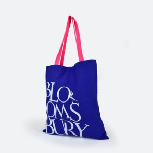
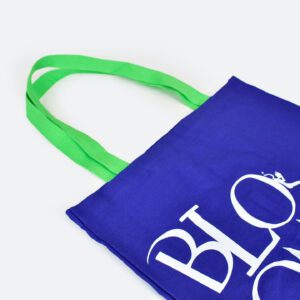
The visual identity of the bag was the next critical hurdle. Bloomsbury’s branding is synonymous with a certain level of sophistication, and maintaining brand integrity meant that the colors had to be exact. This led to a meticulous Pantone-matching process for the bag’s panels. Rather than choosing from a stock list of pre-dyed fabrics, the panels were dyed to match Bloomsbury’s specific brand palette. This level of customization is what separates professional bespoke manufacturing from mass-market printing. To ensure a flawless finish, the iconic Bloomsbury logo was screen-printed in a crisp, stark white on both sides of the fabric before the bags were even sewn together. This "print-before-construction" method is a hallmark of high-end bag production. It allows for edge-to-edge precision and eliminates the risk of ink bleeding into seams or fading near the edges—common issues when printing on pre-made "blank" bags.
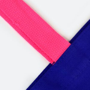
While the body of the bag exuded classic professionalism, the designers knew they needed a "hook"—a design element that would disrupt the visual monotony of a crowded exhibition hall. This was achieved through the revolutionary use of neon handles. In a bold departure from traditional design, the project introduced two distinct handle variations: a piercing neon green and a high-voltage neon pink. These were not just colored handles; they were crafted from heavy-duty cotton webbing, dyed to achieve a vibrant, fluorescent saturation that seemed to glow against the more reserved tones of the bag’s body.
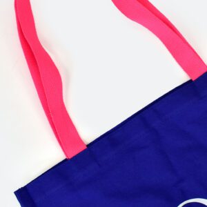
The psychology behind this choice was calculated. Neon colors are naturally eye-catching, triggering an immediate visual response. By pairing these "loud" handles with a "quiet," sophisticated bag body, Bloomsbury created a product that appealed to multiple demographics. The neon pink offered a playful, energetic, and trendy vibe that resonated strongly with younger readers and the "BookTok" community, while the neon green provided a sharp, modern, and unisex appeal. Furthermore, the handles were designed with a specific length to facilitate comfortable over-the-shoulder carrying. This ergonomic consideration is often overlooked in promotional design, but for a book bag, it is essential. A bag that is uncomfortable to carry will eventually be left at home; a bag that sits perfectly on the shoulder becomes an everyday essential.
The decision to keep the rest of the bag’s design minimalist was a masterstroke in restraint. While The Bag Workshop offered various customization options—such as internal zipper pockets for smartphones, magnetic fastenings for security, or woven labels for additional branding—Bloomsbury opted for a clean, streamlined aesthetic. They allowed the quality of the canvas, the precision of the Pantone-matched panels, and the shock of the neon handles to be the primary focus. This "less is more" philosophy ensured the bag didn’t look cluttered or overly "corporate," making it more likely to be integrated into the user’s personal style.
The deployment of these bags at literary festivals and university events proved the strategy’s success. Reports from the field indicated that the bags were not just being accepted; they were being sought after. At university freshers’ fairs, where students are bombarded with hundreds of flyers and cheap plastic trinkets, the Bloomsbury tote became a high-value "get." The vibrant handles acted as a beacon, drawing people to the Bloomsbury stand and sparking conversations that went beyond the merchandise and into the publisher’s upcoming titles and services. The bags turned recipients into brand ambassadors, as the neon handles were easily identifiable from across a crowded room or a busy street.
The feedback from Bloomsbury’s internal team was equally glowing. A testimonial from the project leads highlighted the seamless nature of the production process, praising the design guidance provided by Bella and the production efficiency managed by Greg at The Bag Workshop. This human element of the collaboration was vital. Moving from a conceptual idea to a physical product involving custom dyeing, precision printing, and bespoke assembly requires a high level of trust and communication. The success of the project was as much about the partnership as it was about the design.
Ultimately, the Bloomsbury neon-handle tote serves as a case study in the power of the "bold twist." It proves that you don’t need to reinvent the wheel to make an impact; you simply need to refine the details and introduce an element of surprise. By elevating a standard functional item through premium materials and a daring color palette, Bloomsbury Publishing successfully bridged the gap between traditional prestige and modern trendsetting. These bags continue to circulate, serving as durable, stylish reminders of the Bloomsbury brand and setting a new benchmark for what literary promotional merchandise can achieve. In an era where brand loyalty is hard-won, Bloomsbury showed that a little bit of neon and a lot of quality can go a very long way.