
The global sports nutrition market has undergone a seismic shift over the last decade, transitioning from niche products reserved for professional bodybuilders to a mainstream lifestyle category embraced by casual joggers, CrossFit enthusiasts, and high-performance athletes alike. Within this burgeoning sector, the delivery mechanism of the product has become as vital as the formulation itself. This evolution is perfectly encapsulated in the recent collaboration between SALT! Supplements, the print production experts at COUSIN, the structural design innovators at Burgopak, and the sustainable material leaders at Metsä Board. By reimagining the electrolyte stick sachet format, these partners have created a packaging solution that harmonizes premium aesthetics with logistical precision and environmental responsibility.
Founded by Alfonso Iovine and Kim Connor Streich, SALT! Supplements was born out of a specific frustration common among high-endurance athletes: the lack of hydration solutions that were both scientifically effective and user-friendly. In the world of competitive sports, convenience is not just a luxury; it is a functional requirement. Athletes need supplements that can be consumed on the go, stored easily in gym bags, and accessed without fuss. However, for a premium brand like SALT!, the packaging also needed to act as a physical manifestation of their commitment to quality. To bridge the gap between rugged utility and high-end design, the founders turned to the expertise of COUSIN and Burgopak to develop a container for their 15-count electrolyte stick sachets.
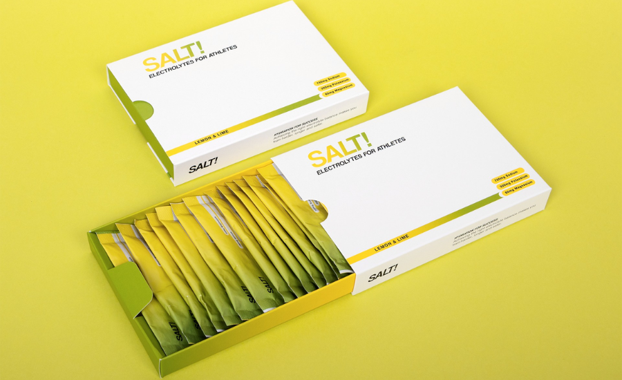
The design challenge was multifaceted. The packaging needed to house 15 individual sachets in a way that felt organized and intentional rather than cluttered. It also needed to survive the rigors of the global supply chain while remaining light enough to minimize shipping costs. Furthermore, in an era where consumers are increasingly wary of "greenwashing," the choice of materials had to be demonstrably sustainable. The solution came in the form of Burgopak’s proprietary "Coupe" pack, a structural design renowned for its space-saving efficiency and theatrical presentation.
Unlike traditional rectangular boxes where sachets are often piled loosely, the Coupe pack utilizes a clever interior geometry that presents the supplement sticks at an angle. This staggered layout ensures that when the consumer opens the pack, they are met with a visually engaging display that highlights the branding on each individual sachet. This "unboxing" experience is a critical touchpoint for modern brands, particularly those operating in the Direct-to-Consumer (D2C) space. By eliminating "dead space" within the box, Burgopak managed to reduce the overall volume of the packaging, which directly correlates to a lower carbon footprint during transport.
The logistics of the design were further refined to meet the strict "Large Letter" requirements of the UK’s Royal Mail. This is a masterstroke of cost-effective engineering. By keeping the thickness of the pack within the specific dimensions required for a large letter rather than a small parcel, SALT! Supplements can significantly reduce their postage expenses. In the competitive world of e-commerce, these savings can be the difference between a sustainable profit margin and a loss-making product line. Moreover, the compact nature of the "Large Letter" format allows the product to be delivered through a standard household letterbox, removing the need for customers to be home to receive their delivery or visit a collection point—a major convenience for the busy athlete.
At the heart of the package’s physical integrity is MetsäBoard Pro FBB Bright, a premium folding boxboard (FBB) provided by Metsä Board. The selection of this specific material was not accidental. Metsä Board, a Finnish company and part of the Metsä Group, is a global leader in the production of fresh fiber paperboards. Their Pro FBB Bright is celebrated for its exceptional whiteness and smooth surface, providing an ideal canvas for high-resolution printing and complex finishes. For SALT! Supplements, the brightness of the board ensures that the colors of the brand’s visual identity pop with clarity, reinforcing the "premium" feel that Iovine and Streich were determined to achieve.
Beyond its aesthetic properties, MetsäBoard Pro FBB Bright offers superior structural strength-to-weight ratios. This means that a thinner, lighter board can provide the same level of protection as a thicker, heavier alternative from a different supplier. For Burgopak, this material efficiency is essential for maintaining the slim profile required for the "Large Letter" shipping format. Furthermore, the board is made from renewable fresh fibers sourced from sustainably managed Northern European forests. Because the fibers are traceable and come from a controlled supply chain, SALT! Supplements can confidently market their product to eco-conscious consumers who demand transparency regarding the environmental impact of their purchases.
Alexander Parker, Burgopak’s Head of Wellness, highlighted the importance of regional material selection in achieving global standards. He noted that while Burgopak operates an international supply chain with access to a vast array of specialty stocks, they maintain a curated list of preferred materials in each region to ensure consistency and sustainability. In the European market, MetsäBoard Pro FBB Bright is a cornerstone of this list. It represents the intersection of performance, value, and environmental stewardship—three pillars that are essential for any brand looking to scale in the modern economy.
The collaborative spirit of the project was echoed by Lee Godwin, Development Director at COUSIN. Having worked with Burgopak on previous ventures, Godwin understood that the synergy between the print production agency and the structural designers would be the key to a "seamless" execution. COUSIN’s role was to ensure that the vision of the founders was translated accurately from the digital screen to the physical product, overseeing the production process to ensure that the final result was a true reflection of the supplement’s internal quality.
From a brand perspective, Alfonso Iovine emphasized that the positive feedback from the athletic community has been overwhelming. For an athlete, the "feel" of the packaging can often influence their perception of the product’s efficacy. A flimsy, poorly designed box suggests a lack of attention to detail, whereas a structurally sound, beautifully finished pack like the one developed for SALT! suggests a product that is professional, reliable, and high-performing. Iovine’s excitement about the launch is rooted in the belief that by perfecting the "functional" side of the athlete’s routine—the storage and transport of their hydration—they are helping those athletes focus entirely on their peak performance.
The success of the SALT! Supplements stick sachet packaging serves as a blueprint for the future of the wellness industry. It demonstrates that sustainability and luxury are not mutually exclusive. By utilizing advanced materials like MetsäBoard Pro FBB Bright and innovative structural designs like the Burgopak Coupe, brands can create products that are as kind to the planet as they are appealing to the eye. Furthermore, the strategic focus on logistical optimization (the "Large Letter" format) shows a sophisticated understanding of the modern retail landscape, where shipping efficiency is a primary driver of business success.
As the sports nutrition market continues to grow, the pressure on brands to innovate will only increase. Consumers are no longer satisfied with standard "off-the-shelf" packaging solutions. They want products that feel tailored to their lifestyle—portable, aesthetically pleasing, and ethically produced. The partnership between SALT! Supplements, COUSIN, Burgopak, and Metsä Board has met this challenge head-on, delivering a packaging solution that is as robust and energized as the athletes who use the products inside. This project stands as a testament to the power of collaboration in the packaging industry, proving that when material science, structural design, and brand vision align, the result is a product that truly stands out on the shelf and in the mailbox.