The contemporary publishing landscape is no longer merely a battle for shelf space; it is a sophisticated competition for cultural mindshare and lifestyle integration. In an era where a book is as much a fashion statement as it is a vessel for narrative, the ancillary merchandise surrounding a release or a brand has become a critical touchpoint for consumer engagement. Bloomsbury Publishing, a titan of the literary world, recently recognized that to maintain its vanguard status, its promotional materials needed to transcend the utilitarian. The result of this realization was a collaboration with The Bag Workshop to produce a custom tote bag that didn’t just carry books but broadcasted a brand’s evolution. By integrating high-visibility neon accents with classic Pantone-matched aesthetics, Bloomsbury successfully turned the humble book bag into a high-demand fashion accessory that dominated literary festivals and university campuses alike.

To understand the necessity of this project, one must first look at the stature of Bloomsbury Publishing. Founded in 1986, the house has grown from a courageous independent start-up into a global powerhouse with offices in London, New York, New Delhi, and Sydney. While perhaps most famously known as the original home of the Harry Potter series, Bloomsbury’s portfolio is remarkably diverse, spanning high-level academic texts, award-winning literary fiction, and essential non-fiction. This breadth of content presents a unique branding challenge: how do you create a single promotional item that appeals to a PhD candidate at an academic symposium and a teenager at a young adult fiction festival? The answer lay in the "elevated tote," a product that respects the traditional "bookish" aesthetic while injecting a dose of modern, high-street energy.
The "sea of beige" is a well-known phenomenon at literary events. For decades, the standard promotional giveaway has been a thin, off-white cotton bag with a single-color logo. While functional, these items often lack the durability to survive a weekend of heavy book hauling and the visual distinction to be noticed in a crowded exhibition hall. Bloomsbury sought to shatter this monotony. Their objective was to develop a "walking billboard" that recipients would not only keep but actively choose to use in their daily lives, thereby extending the brand’s reach into grocery stores, libraries, and city streets long after the initial event had concluded.
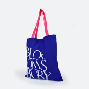
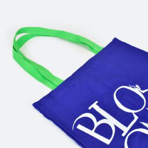
The design journey began with a focus on material integrity and color precision. Unlike mass-produced, "off-the-shelf" bags that are printed after assembly, this project utilized a bespoke manufacturing process. The Bag Workshop and Bloomsbury’s design team opted for a heavy-duty, premium cotton canvas. This choice was foundational; a thicker canvas provides the structural rigidity necessary to hold heavy hardback volumes without sagging, ensuring the brand’s logo remains flat and legible. To ensure the bag was an authentic extension of the Bloomsbury identity, the fabric panels were Pantone-matched to the publisher’s specific corporate palette. This level of customization is rarely seen in promotional merchandise, which usually relies on stock fabric colors that are "close enough." By dyeing the fabric to exact specifications, Bloomsbury ensured that their brand consistency remained uncompromised.
The technical execution of the branding was equally meticulous. Rather than utilizing standard screen printing on a finished bag—a process that often leaves gaps near the seams or results in distorted graphics—The Bag Workshop employed a "print-then-stitch" methodology. The Bloomsbury logo, rendered in a crisp, high-contrast white, was printed onto the flat canvas panels before the bag was ever sewn together. This allowed for an edge-to-edge finish and a level of precision that signaled high-end quality. The white-on-color contrast provided a clean, professional look that served as the perfect "classic" anchor for the design’s more radical elements.
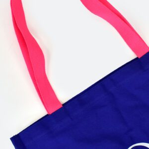
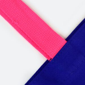
The true masterstroke of the project, however, was the handle design. In a move that bridged the gap between traditional publishing and contemporary streetwear trends, the team decided to move away from matching canvas handles. Instead, they introduced high-density cotton webbing handles in two electric, fluorescent shades: neon green and neon pink. This was not a random aesthetic choice; neon has seen a massive resurgence in graphic design and fashion as a way to signify "newness" and digital-age vibrancy. By offering two distinct handle colors, Bloomsbury introduced an element of choice and collectability. Attendees at events were seen actively hunting for their preferred color, turning a simple giveaway into a sought-after "drop."
The ergonomics of the handles were also carefully considered. Standard tote bags often feature handles that are just a few inches too short, causing the bag to sit uncomfortably high under the arm or slip off the shoulder when the wearer is wearing a coat. The Bloomsbury tote featured elongated handles designed specifically for over-the-shoulder carry. This minor adjustment in specifications significantly increased the bag’s utility, ensuring it would become the "go-to" bag for students and commuters who require comfort during long periods of use.
When the bags were finally debuted at major literary festivals and university freshers’ fairs, the reaction was instantaneous. In an environment where attendees are often overwhelmed with free "swag," the Bloomsbury totes created a tangible buzz. The neon handles acted as visual beacons; even from across a crowded hall, the bags were unmistakable. This high visibility triggered a psychological "fear of missing out" (FOMO) among event-goers. People were no longer just accepting a bag because it was free; they were seeking out the Bloomsbury stand specifically to acquire one. This shift in consumer behavior is the ultimate goal of any promotional campaign—moving from passive reception to active pursuit.
Beyond the immediate visual impact, the bags facilitated a deeper level of brand engagement. The quality of the construction—the thick canvas, the precise Pantone matching, and the durable webbing—communicated a message of value. When a brand gives away a high-quality item, it subconsciously signals to the consumer that the brand values its audience and its own reputation. For a publisher like Bloomsbury, whose brand is built on the quality of its curation and the prestige of its authors, this alignment between physical merchandise and brand ethos was essential.
The internal feedback from the Bloomsbury team was overwhelmingly positive, as evidenced by the praise for the project’s coordinators, Bella and Greg. The success of the partnership highlighted the importance of choosing a supplier that understands the nuances of bespoke production. The ability to navigate the complexities of custom dyeing, precision printing, and specialized stitching turned what could have been a standard procurement task into a landmark marketing success. The testimonial from the client emphasized not just the final product, but the "care and attention" throughout the design process, proving that the best branded merchandise is born from a collaborative, detail-oriented relationship.
In conclusion, the Bloomsbury neon-handled tote bag serves as a definitive case study in modern brand activation. It proves that even the most traditional industries can find new life through thoughtful, trend-aware design. By rejecting the "generic" and embracing the "bespoke," Bloomsbury Publishing transformed a simple tool for carrying books into a powerful emblem of their contemporary identity. These bags continue to circulate in the wild, serving as durable, stylish reminders of Bloomsbury’s commitment to excellence. For any organization looking to make a lasting impression in a saturated market, the lesson is clear: don’t just put your logo on a product—reimagine the product until it is an irresistible extension of your brand’s soul. Through the bold use of color and an uncompromising commitment to quality, Bloomsbury didn’t just make a bag; they made a statement.

