
In the sophisticated and often traditional world of global publishing, brand identity is more than just a logo on a spine; it is a promise of quality, a badge of intellectual curiosity, and a cultural touchstone. Bloomsbury Publishing, a name synonymous with both literary prestige and commercial juggernauts like the Harry Potter series, has long understood that its physical presence at events is a vital extension of its editorial excellence. However, in an era where every literary festival, university campus, and trade fair is awash with promotional merchandise, the challenge of truly standing out has never been more acute. To solve this, Bloomsbury moved beyond the conventional, partnering with The Bag Workshop to create a custom tote bag that serves as a masterclass in high-impact, design-led marketing. By blending their classic heritage with a bold, neon-infused aesthetic, they transformed a simple utility item into a coveted fashion accessory and a powerful mobile advertisement.
Bloomsbury Publishing is not merely another player in the industry; it is a global powerhouse with a footprint that spans from the hallowed halls of academic research to the bedside tables of millions of fiction readers. Founded in 1986, the house has built a reputation for nurturing diverse voices and maintaining a standard of excellence that commands respect. Yet, even a titan like Bloomsbury must navigate a marketplace saturated with "freebies." At events like the London Book Fair or the Edinburgh International Book Festival, the "book bag" is a ubiquitous staple. Most are functional but forgettable—often made of thin, natural-colored cotton with standard black or blue printing. For Bloomsbury, the objective was clear: they required a promotional tool that reflected their status as an innovator. They needed a bag that people wouldn’t just use to carry books, but one they would choose to wear as part of their personal style, thereby extending the brand’s visibility far beyond the confines of a single event.
The creative journey began with a deep analysis of what makes a tote bag "premium." The Bag Workshop, known for its bespoke approach to textile manufacturing, recognized that the foundation of the project had to be quality. Rather than opting for a lightweight, disposable promotional material, the team selected a heavy-duty, high-quality cotton canvas. This choice was strategic; a thicker canvas offers a superior tactile experience, holds its shape better when filled with heavy hardbacks, and communicates a sense of durability that aligns with Bloomsbury’s long-standing reputation. The goal was to move away from the "disposable" culture of marketing and toward a "keepable" product that would last for years, providing a long-term return on investment through repeated use.
The defining characteristic of this collaboration was the meticulous attention to color and branding. Brand integrity is non-negotiable for a company of Bloomsbury’s stature. To ensure the bags were an exact extension of their corporate identity, The Bag Workshop utilized precision Pantone matching for the fabric panels. This process involves dyeing the fabric to specific color codes, ensuring that the hue on the bag is an identical match to the colors used in Bloomsbury’s digital and print media. To provide a crisp, professional contrast, the iconic Bloomsbury logo was screen-printed in a brilliant, stark white on both sides of the bag. This minimalist approach to the central body of the bag allowed the brand’s name to pop against the custom-dyed background, ensuring instant recognition from a distance.
One of the most significant technical triumphs of this project was the manufacturing sequence itself. In standard promotional printing, logos are often applied to pre-made, off-the-shelf bags. This frequently results in "dead zones" near the seams where printing is impossible, or potential registration issues where the design looks slightly misaligned. The Bag Workshop avoided these pitfalls by printing the fabric panels before the bags were stitched together. This "print-then-construct" methodology allows for edge-to-edge design precision and a flawless finish that is simply unattainable with mass-produced blanks. It is this level of craftsmanship that elevates a promotional item into a retail-quality product, bridging the gap between a giveaway and a premium piece of merchandise.
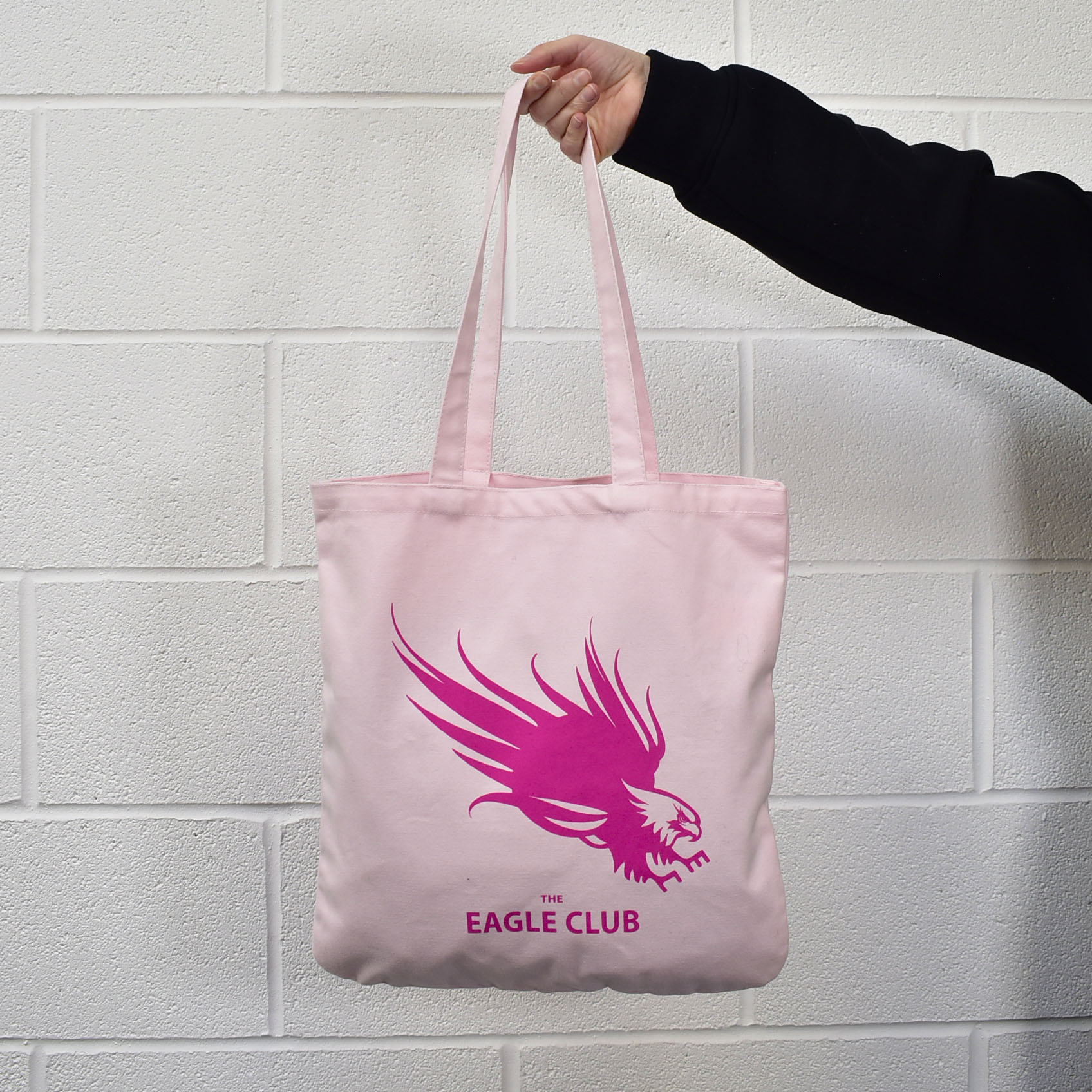
However, the true stroke of genius in the design was the introduction of the neon handles. While the body of the bag remained classic and sophisticated, the handles provided a jolt of contemporary energy. Bloomsbury and The Bag Workshop decided on two distinct variations: one featuring a piercing neon green and the other a vibrant, energetic neon pink. These handles were crafted from robust cotton webbing, dyed to a fluorescent intensity that demands attention. The psychological impact of neon cannot be overstated; in a sea of beige, black, and navy totes, a flash of neon pink or green acts as a visual magnet. It signals a brand that is confident, modern, and unafraid to experiment. Furthermore, the handles were designed with an intentional "long-drop" length. This ergonomic consideration ensures the bag sits comfortably over the shoulder, even when the wearer is bundled in a winter coat—a practical detail that significantly increases the likelihood of the bag being used daily.
The strategic choice to offer two different handle colors also introduced an element of personalization and "collectibility" to the campaign. At events, attendees often feel a sense of "FOMO" (fear of missing out) when they see others carrying a particularly striking item. By having two vibrant options, Bloomsbury turned the distribution of these bags into a conversation. Recipients weren’t just taking a bag; they were making a choice between the "Green Edition" or the "Pink Edition," creating a micro-moment of engagement with the brand that a standard bag could never achieve. This simple design twist transformed the bag from a container into a statement piece, sparking social media interest and organic word-of-mouth promotion.
The real-world results of this design-led approach were immediate and measurable. When the bags debuted at major literary festivals and university "Freshers’ Fairs," they became the most sought-after items on-site. The Bag Workshop reported that the feedback from Bloomsbury was overwhelmingly positive, noting that the bags didn’t just disappear into the crowd—they dominated it. Attendees were frequently seen stopping Bloomsbury representatives to ask how they could acquire one, and the bags were quickly spotted in "bookstagram" posts and literary blogs, providing the brand with valuable digital impressions that reached far beyond the physical events. The bags effectively became "walking billboards," turning every recipient into a brand ambassador as they navigated city streets, libraries, and bookstores.
The internal feedback from the Bloomsbury team further solidified the success of the partnership. Bella, a key figure in the design process, was praised for her meticulous care and creative vision, while Greg from the production side was lauded for his seamless execution and timely delivery. This synergy between the client’s brand vision and the manufacturer’s technical expertise is what allowed such a bold concept to come to life without compromising on quality. The project proved that even in a digital-first world, the power of a tangible, beautifully designed physical object remains a cornerstone of effective marketing.
Ultimately, the Bloomsbury neon-handled tote bag serves as a compelling case study for any brand looking to refresh its image or make a splash in a crowded market. It demonstrates that you do not need to overcomplicate a design to make it effective. By focusing on three core pillars—material quality, brand consistency through Pantone matching, and a single, daring design "hook" (the neon handles)—Bloomsbury created a product that perfectly encapsulates their dual identity as a storied institution and a forward-thinking innovator. This project highlights a shift in the "Tote Bag Economy," where the value of a promotional item is no longer just in its utility, but in its ability to spark joy, express personality, and command attention in a cluttered visual landscape. As Bloomsbury continues to lead the literary world, these vibrant totes remain a lasting symbol of their commitment to excellence, one neon-pink handle at a time.