

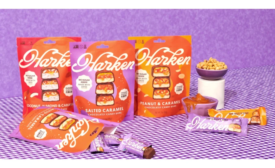
The modern confectionery aisle is currently undergoing a radical transformation, caught between the legacy of sugar-laden traditional treats and a new wave of health-conscious alternatives that often prioritize nutritional statistics over sensory pleasure. Standing at the vanguard of this evolution is Harken Sweets, a woman-owned enterprise that has successfully carved out a niche by utilizing the ancient superfruit—the date—as the foundational architecture for its candy bars. Recently, the brand announced a comprehensive packaging refresh across its snack-size pouch lineup, a move that signals a profound shift in how "better-for-you" (BFY) snacks communicate value to a discerning, flavor-seeking public. By pivoting from a clinical, health-centric aesthetic to one that celebrates the visceral, mouth-watering reality of its products, Harken Sweets is betting that visual indulgence is the most effective way to bridge the gap between wellness and whim.
The impetus for this design metamorphosis was not born out of a boardroom whim but was instead distilled from a massive repository of consumer intelligence. Harken Sweets meticulously analyzed more than 11,000 customer reviews to determine exactly what triggered a repeat purchase. The data revealed a singular, undeniable truth: while consumers appreciated the health benefits, they returned because of the taste. In the competitive world of CPG (Consumer Packaged Goods), brands often fall into the trap of over-explaining their nutritional "virtues" on the front of the pack, cluttering the visual field with icons, percentages, and certifications. Harken’s new design rejects this clutter. By identifying taste as the primary driver of loyalty, the brand decided to let the product’s internal architecture—the layers of viscous date caramel, the snap of the chocolate coating, and the intricate textures of the center—speak for itself through high-resolution, macro-photography.
This "front and center" approach to packaging design taps into a psychological phenomenon known as "visual hunger." When consumers see a cross-section of a candy bar, revealing the gooey, golden interior of a date-based caramel, it triggers a sensory response that words like "low-glycemic" or "organic" cannot replicate. For Harken Sweets, the goal was to evoke the same emotional response one feels when looking at a traditional Snickers or Milky Way, but with the added peace of mind that comes from a cleaner ingredient deck. The new pouches feature dramatic, close-up imagery that highlights the "hero" ingredients, effectively promising a premium eating experience before the bag is even opened.
Founder and CEO Katie Lefkowitz, a veteran of the food industry who previously played a pivotal role at the disruptive pizza brand Caulipower, understands the nuances of category disruption. Her vision for Harken Sweets was always rooted in a personal passion for candy, coupled with a refusal to accept the trade-offs typically associated with "healthy" versions of classic treats. "I’ve loved candy my whole life," Lefkowitz remarked during the unveiling of the new design. "I started Harken because I wanted to make the bar I’d reach for when I wanted something sweet. Our customers kept telling us how much they loved the taste, so we took our cue from them. I want you to see that gooey caramel on the bag and think, ‘I want a bite of that.’"
The redesign also reflects a masterclass in the "less is more" philosophy of modern branding. While the previous packaging may have leaned more heavily on its functional benefits, the new snack-size pouches have been streamlined to feature only two primary claims: "No sugar added, made with dates" and "Good source of fiber." This simplification is a strategic move to capture the "five-second" shopper—the consumer who makes a split-second decision while walking down the aisle. By focusing on dates as the sweetener, Harken differentiates itself from the myriad of BFY brands that rely on sugar alcohols like erythritol or allulose, which can sometimes carry a chemical aftertaste or cause digestive discomfort. Dates provide a rich, humectant quality and a natural caramel flavor profile that aligns perfectly with the brand’s "craveability" mission.
Beyond the aesthetics, the shift toward date-based confectionery represents a broader trend in the global food market. As consumers become increasingly wary of ultra-processed foods (UPFs), the demand for "whole-food-based" sweets has skyrocketed. Dates are uniquely positioned for this role; they are high in antioxidants, packed with potassium, and offer a slow-release form of energy due to their high fiber content. By putting the date caramel at the heart of the visual identity, Harken Sweets is not just selling a candy bar; they are selling a more sophisticated way to indulge. The fiber content, in particular, is a significant selling point that the brand has wisely retained on the front of the pack, as "gut health" continues to be a top-of-mind concern for modern shoppers.
The packaging refresh also addresses the "snackification" of the American diet. The snack-size pouches are designed for portability and portion control, catering to a demographic that wants a high-quality treat that fits into a busy, mobile lifestyle. The vibrant colors and bold typography of the new design ensure that the product pops against the muted tones often found in the health food section, while simultaneously looking right at home next to legacy candy brands. This "crossover appeal" is critical for a brand looking to move beyond specialty health stores and into mainstream retail environments where they must compete for the attention of the average consumer.
The technical execution of the refresh involved a careful calibration of color palettes and lighting in the photography to ensure the chocolate looked creamy rather than chalky, and the caramel looked fluid rather than stiff. This attention to detail is a hallmark of premium branding. In an era where "food porn" dominates social media platforms like Instagram and TikTok, Harken Sweets is leveraging those same visual cues to build brand equity. The packaging serves as a silent salesperson, conveying a narrative of indulgence, quality, and transparency.
Moreover, Harken Sweets’ status as a woman-owned business adds a layer of authenticity and mission-driven purpose to the brand. In a confectionery landscape historically dominated by a few massive conglomerates, independent brands like Harken bring a fresh perspective to product development. Lefkowitz’s approach is deeply rooted in empathy for the consumer—the person who wants to satisfy a late-night craving or enjoy a midday treat without the "sugar crash" or the guilt associated with traditional candy. This consumer-first mentality is what led to the analysis of those 11,000 reviews, ensuring that the brand’s evolution was a collaborative process with its community.
As Harken Sweets rolls out these new snack-size pouches, the industry will be watching closely. The success of this refresh could provide a blueprint for other BFY brands struggling to balance their "healthy" credentials with the necessity of "delicious" appeal. The message from Harken is clear: health benefits might get a product into the shopping cart once, but it is the sensory experience—the taste, the texture, and the visual promise of a satisfying bite—that keeps it there. By putting the candy front and center, Harken Sweets is embracing its identity as a true confectionery brand, one that just happens to be powered by the nutritional prowess of dates.
In conclusion, the new look for Harken Sweets is more than just a change of clothes; it is a strategic declaration of confidence. It signals a brand that has found its voice and knows exactly what its audience wants. In the crowded, noisy world of retail, Harken is cutting through the static by focusing on the most fundamental reason people eat candy: the pure, unadulterated joy of something sweet. With its gooey date caramel and crunchy textures now showcased in all their glory, Harken Sweets is well-positioned to lead the next generation of the "better-for-you" revolution, one bite-sized pouch at a time.