
In a significant strategic move to reassert its dominance in the competitive bathing and personal care market, the venerable Imperial Leather brand has undergone a comprehensive visual overhaul, spearheaded by the independent design consultancy, Brandon Consultants. This ambitious revitalization project targeted the very core of the brand’s identity, focusing intensely on recrafting its iconic heritage insignia and executing a complete redesign across its entire product packaging spectrum, spanning soaps, shower gels, bath luxuries, and the innovative Foamburst line.
Imperial Leather, a name synonymous with quality and tradition in bathrooms for generations, had, according to brand custodians, drifted too far from the visual cues that cemented its initial success. Richard Taylor, co-founder of Brandon Consultants, articulated the challenge: "Revitalizing legacy brands is a cornerstone of our expertise at Brandon. When you consider the bathroom space, few brands possess the deep historical resonance of Imperial Leather. However, the landscape of washing and bathing has continuously evolved, and while Imperial Leather has attempted to keep pace, it had unintentionally alienated itself from the very elements that made it iconic." Taylor noted that this deviation placed the brand in jeopardy, facing stiff competition from rivals who were capitalizing on shifting consumer preferences. "Our mandate was clear: enable the brand to stand firm within a dynamic category by meticulously rebuilding its distinctive brand assets, thereby restoring consumer recognition and desirability among shoppers who had started exploring alternatives."
The foundation for this dramatic design pivot was a newly established brand vision centered on the concept of "abundance." This aspirational theme required a tangible translation into a compelling visual strategy that could operate effectively both on the shelf and in broader marketing communications. Extensive consumer research underscored a critical finding: the brand’s most potent recognition tool, the regal crown logo, had been diluted or entirely lost in previous design iterations. Reintroducing this symbol was paramount to reinforcing Imperial Leather’s established credentials for quality and expertise.
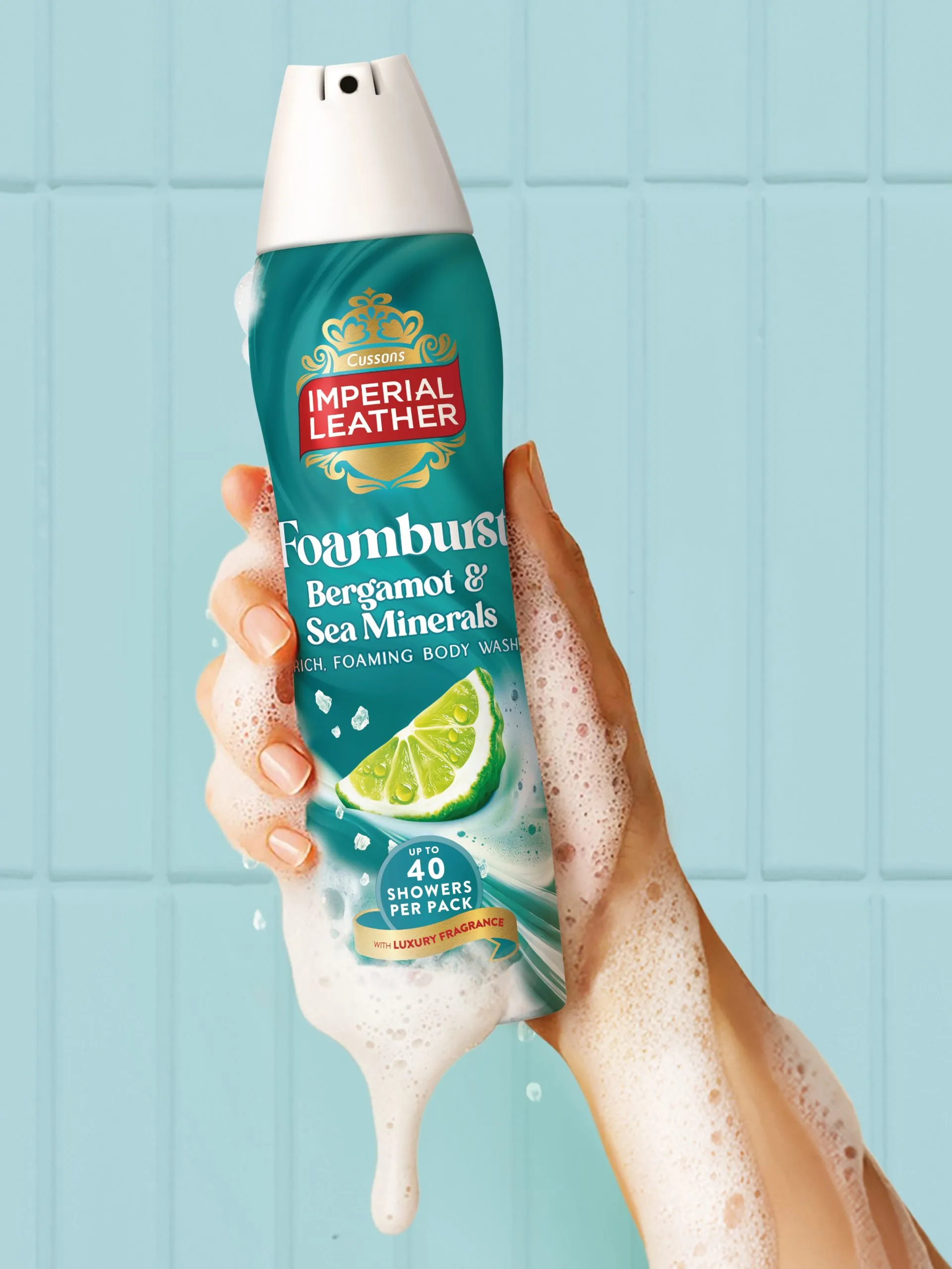
Brandon’s design process was one of thoughtful restoration blended with subtle modernization. The existing Imperial Leather wordmark underwent refinement to enhance its on-shelf impact and legibility. Crucially, the distinguished red ribbon—a recognized hallmark of the brand—was reintroduced as a central organizing element. The crown itself was meticulously redrawn. Upon closer inspection, the newly crafted emblem subtly integrates modern visual references to fragrance notes, the dynamism of water droplets, and the luxurious texture of swirling lather. This delicate balance ensures the new design honors its enduring legacy while feeling entirely contemporary.
Katie Rowley, Design Director at Brandon Consultants, elaborated on the nuanced approach to duality that informed the broader branding system. "Our strategy sought to harmonize inherent tensions: balancing the established heritage with modern aesthetics, sophistication with everyday accessibility. Furthermore, it was vital that the design communicated the celebrated dualities within Imperial Leather products themselves—the interplay between opulent lather and signature fragrance."
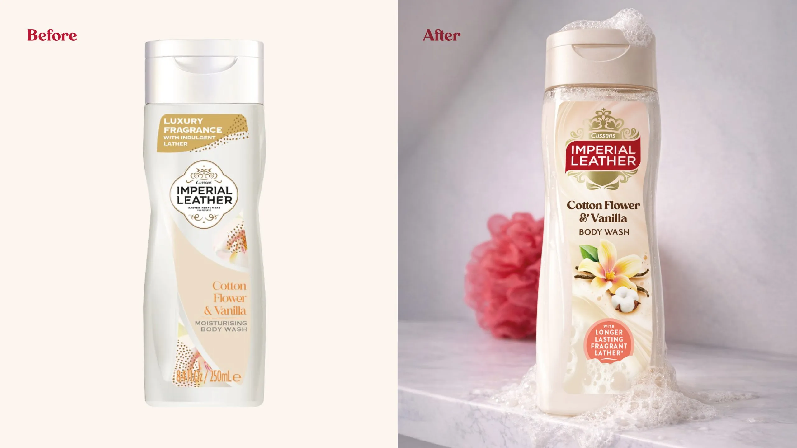
Rowley detailed the development of a new sensory graphic language designed to evoke freshness yet retain classic appeal, speaking directly to the brand’s promise of generosity and accessible, daily indulgence. Complementing the refined wordmark, Brandon developed a suite of specialized brand assets. These include sophisticated "fragrance cameos"—visual representations tailored to each scent profile—and dynamic swirl and foam textures, all intended to immediately conjure the rich, indulgent experience associated with using the products.
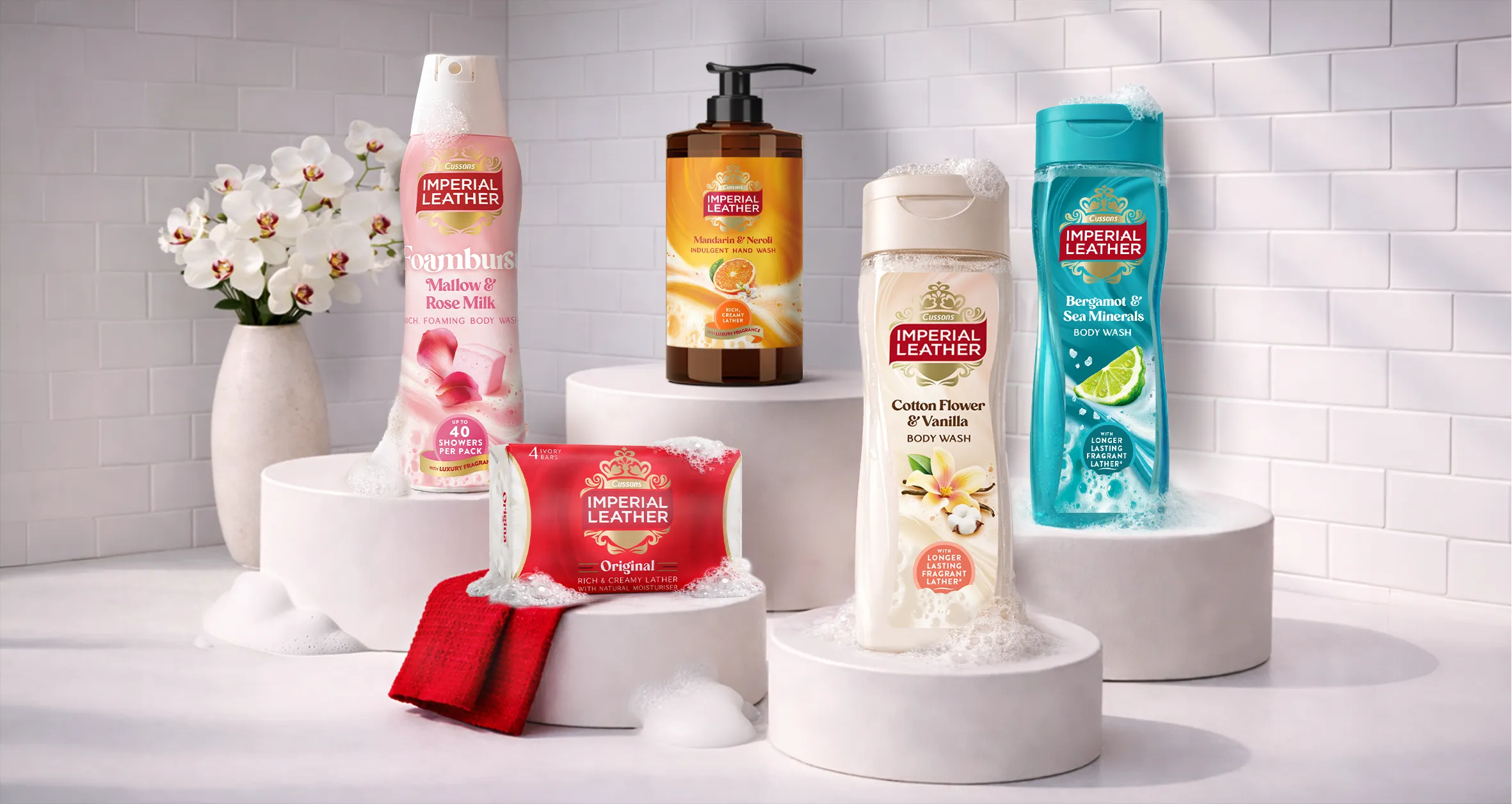
The comprehensive rebranding extended far beyond the logo. Brandon established clear, unified design principles across the entire masterbrand architecture. This required an overhaul of the packaging for all product lines—bar soaps, body washes, bath products, and the specialized Foamburst range.
The agency developed a hierarchical system ensuring that while each sub-range could express its unique product benefits and scent profile, all packaging communicated a cohesive family identity under the Imperial Leather masterbrand umbrella. Design choices were deliberate: the depiction of foam flow or the texture of the lather varies subtly across packaging formats to reflect the specific product experience, yet the overall aesthetic anchors them firmly together. Every graphic element, from typography to color application, was scrutinized to elevate the perception of luxurious fragrance and rich formulation.

Sophie Daniels, Senior Brand and Innovation Manager at PZ Cussons (the parent company), expressed strong confidence in the outcome. "Imperial Leather has always been celebrated for its dense lather and distinctive scents. Our directive to the Brandon team was to capture and amplify these qualities visually, revitalizing the brand in a manner that deeply resonates with the qualities consumers have consistently cherished." Daniels concluded, "The resulting design is enduring, highly distinctive, and critically, has successfully repositioned Imperial Leather as a desirable and relevant brand, not just for today, but for the future."
The newly reimagined Imperial Leather branding and packaging suite is currently rolling out across retail channels throughout the United Kingdom, marking a triumphant return to form for one of Britain’s most cherished personal care icons. The collaboration between the brand owner and Brandon Consultants serves as a compelling case study in how heritage can be skillfully leveraged to achieve modern market relevance.


