
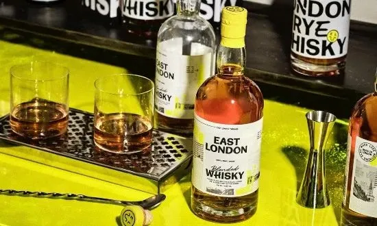
The established world of whisky packaging, often characterized by reverent nods to centuries of heritage and an almost obligatory air of subdued elegance, has just received a jolt of raw, metropolitan energy. Design agency Thirst has unveiled the transformative packaging for East London Liquor Company’s inaugural blended grain whisky, a creation that consciously pivots away from dusty tradition to embrace a definition of "premium" forged in the vibrant, often gritty, crucible of East London itself. This first-of-its-kind blend required a visual language that spoke volumes about its origins, demanding a departure from the category’s prevailing conservatism.
The core mandate given to Thirst was clear: engineer a packaging design for a new blended grain whisky that could confidently occupy an accessible premium price tier while simultaneously delivering a tangible, tactile sense of superior value the moment it was handled. It needed to resonate as expensive without ever feeling untouchable or overly refined—a direct reflection of the neighborhood it champions.
To distill the essence of this specific urban environment, Thirst’s senior designer, Alex Page, embarked on a unique immersion exercise with the client, an endeavor they playfully termed an "urban safari." This wasn’t a typical mood-boarding session; it was an intensive, day-long exploration deep within the arteries of East London. The objective was to gather the authentic, often overlooked visual debris of daily urban life. Armed with cameras, the team documented everything that contributed to the area’s unique aesthetic: the fading, layered textures of old brickwork, the utilitarian beauty of faded signage, the idiosyncratic typography found on market stalls, the imposing lines of industrial architecture, and the accidental patterns created by urban wear and tear. This raw, heterogeneous material was not merely used for inspiration; it was intended to serve as the foundational DNA for a layered, richly textured premium aesthetic—one that felt decidedly lived-in rather than hermetically sealed in a showroom.
The resulting bottle design is a masterclass in tactile complexity and visual narrative. It rejects the minimalist approach favored by many contemporary spirits brands, opting instead for a dense, rewarding composition. The glass vessel itself is adorned with an array of sophisticated finishing techniques, intentionally stacked to encourage closer inspection. These include deeply etched embossing that catches the light, subtle micro-embossing that rewards a focused touch, high-gloss spot varnishes strategically placed to mimic wet surfaces or industrial sheen, and precise foil detailing that provides necessary flashes of brilliance. Crucially, the design incorporates carefully executed die-cut shapes, breaking the traditional boundary between label and bottle.
This rich tapestry of finishes is unified by a design strategy that marries bold, structured typography—evoking the clarity of wayfinding signs—with a collage-like layering technique. This layering technique visually mimics the way posters overlap on hoardings or paint peels to reveal older colors underneath, embodying the area’s history of constant regeneration. These foundational elements are punctuated by sharp, unexpected flashes of neon energy, channeling the vibrant nightlife and contemporary creative pulse of the district.
Sam Cutler, Creative Director at Thirst, elaborated on the philosophy driving this radical departure. “Whisky, as a category, often feels constrained by an antiquated, almost stuffy notion of what premium means,” Cutler explained. “Our challenge was to create something that felt inherently valuable and substantial in the hand, without succumbing to preciousness. East London possesses its own unique stratum of luxury, one built not on pedigree or restraint, but on stark contrast, undeniable character, and raw authenticity. We engineered a label that carries that depth. It needs to stop someone scrolling or scanning from across a dimly lit bar, demanding attention. But its true payoff comes when they physically pick it up; the tactile experience must then justify the price point and the brand story.”
The deliberate sensory overload is calibrated to speak directly to a consumer who values provenance and process over inherited status. The packaging tells a story of grit meeting refinement—a direct metaphor for the blended grain whisky inside, which often utilizes a mix of base spirits to achieve complexity and approachability.
Alex Wolpert, Founder of the East London Liquor Company, reflected positively on the intense collaborative process. “Inviting fresh perspectives to dissect the core identity of your brand is always a challenging yet profoundly illuminating exercise,” Wolpert noted. “The time spent with Thirst was a necessary and healthy interrogation of what truly constitutes the fundamental DNA of East London Liquor. Where their expertise truly crystallized was in the development of the creative strategy—translating that intangible spirit of place into a concrete, persuasive visual language that breaks through the noise in a crowded spirits cabinet.”
The success of this project lies in its refusal to compromise on authenticity for the sake of category convention. Traditional high-end whiskies often rely on heavy, dark glass and muted tones to signal gravitas. Thirst’s design for the East London blend utilizes texture and layered complexity as its primary indicators of quality. The embossing isn’t just decorative; it mimics the raised lettering on old industrial plaques. The spot varnish isn’t just shine; it suggests the slick, rain-washed pavements under streetlights.
This approach positions the product not as a relic of the past, but as a contemporary icon of urban achievement. It targets a consumer base that appreciates craftsmanship, whether that craft is applied to distilling, coding, or designing, and who recognizes value in products that actively engage with their environment. By treating the urban landscape as its primary source material—its own ‘terroir’—the packaging for this blended grain whisky successfully carves out a distinct, highly desirable niche in the competitive premium spirits market. It asserts that sophistication can be loud, tactile, and rooted firmly in the present-day dynamism of a world-class city neighborhood, rather than exclusively in the quiet reverence of a distant, traditional distillery. The design ensures that the first impression is immediate, followed by a lingering appreciation for its intricate detail, making the act of purchasing and pouring an extension of the brand’s rebellious, sophisticated spirit.


