
In the high-stakes world of international publishing, a brand’s physical presence is often just as critical as its digital footprint. Bloomsbury Publishing, a titan of the literary world known for its eclectic and prestigious catalog, recently faced a modern marketing conundrum: how to remain relevant and visible in a sea of promotional noise. The solution did not come in the form of a digital campaign or a social media blitz, but rather through a masterfully executed piece of physical merchandise. By collaborating with the bespoke experts at The Bag Workshop, Bloomsbury developed a custom tote bag that successfully bridged the gap between traditional literary elegance and contemporary street-style aesthetics. This case study explores the strategic design choices, technical precision, and overwhelming market success of a promotional item that turned the humble book bag into a high-demand fashion statement.

Bloomsbury Publishing is a name synonymous with quality. Since its inception in 1986, the house has grown from a daring independent start-up into a global powerhouse with offices in London, New York, Sydney, and New Delhi. Their portfolio is staggering, ranging from the cultural phenomenon of the Harry Potter series to Nobel Prize-winning fiction and high-level academic texts. However, prestige can sometimes lead to a brand feeling overly formal or detached from younger, more trend-conscious demographics. In the context of literary festivals, university campuses, and trade fairs, the "standard" tote bag has become a ubiquitous, almost invisible commodity. Most attendees at events like the Hay Festival or the Edinburgh International Book Festival are inundated with thin, beige calico bags that are frequently discarded or relegated to the back of a closet. Bloomsbury recognized that to truly engage their audience, they needed a product that moved beyond utility into the realm of the "must-have" accessory.
The creative brief was deceptive in its simplicity: create a functional book bag that honors Bloomsbury’s classic identity while incorporating a bold, modern twist. The objective was to produce a "walking billboard" that readers would be proud to carry daily, not just during the event where they received it. This required a move away from off-the-shelf, mass-produced items and toward a fully bespoke manufacturing process. The Bag Workshop was selected as the partner for this venture due to their reputation for high-end customization and their ability to handle complex production requirements, such as precise Pantone matching and advanced printing techniques.
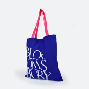
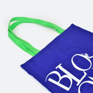
The foundation of the design was a high-grade cotton canvas. Unlike the flimsy materials used in budget promotional bags, this canvas was selected for its tactile weight and durability. A book bag, after all, must be capable of carrying several heavy hardbacks without losing its shape or straining the seams. The choice of material immediately signaled to the recipient that this was a premium item, elevating the perceived value of the Bloomsbury brand. To ensure the brand’s visual integrity, the panels of the bag were Pantone-matched to Bloomsbury’s specific corporate colors. This level of detail is often overlooked in promotional merchandise, where "close enough" is the standard. By insisting on exact color matching, Bloomsbury ensured that the bags were an authentic extension of their existing brand ecosystem.
One of the most significant technical decisions made during the production process was the "print-before-stitch" methodology. In standard tote bag printing, designs are applied to pre-made bags. This often results in "dead zones" near the seams or handles where the ink cannot reach, leading to a cheap, unfinished look. For the Bloomsbury project, the iconic white logo was screen-printed onto the flat fabric panels before the bag was ever assembled. This allowed for an edge-to-edge finish and a crispness of detail that is impossible to achieve on a finished garment. The result was a stark, high-contrast visual—the brilliant white logo popping against the rich, saturated background of the canvas.
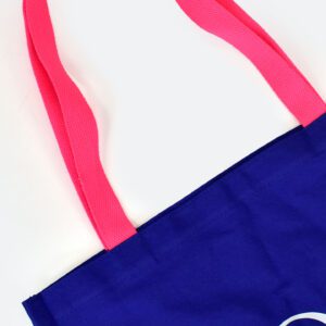
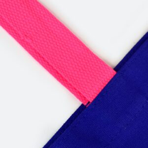
However, the true stroke of genius lay in the handle design. In a move that challenged the conservative norms of literary branding, the team decided to eschew matching handles in favor of two high-visibility neon options: an electric neon green and a vibrant neon pink. This was a strategic play on color psychology. Neon colors are inherently attention-grabbing; they trigger a primal visual response that forces the eye to take notice. By pairing these "acid" tones with the sophisticated, classic body of the bag, Bloomsbury created a visual tension that felt fresh, youthful, and undeniably modern.
The handles were crafted from heavy-duty cotton webbing, ensuring they were comfortable even when the bag was at full capacity. Furthermore, the length of the handles was customized. Standard totes often have handles that are too short for comfortable shoulder wear, especially when the user is wearing a coat. Bloomsbury’s bags featured an extended handle length, specifically designed to sit perfectly on the shoulder. This focus on ergonomics meant that the bag was not just beautiful, but highly practical for the daily commute, the grocery run, or a day spent browsing bookstore shelves.
The deployment of these bags was a masterclass in experiential marketing. They were distributed at key touchpoints, including university "freshers’ fairs" and major international literary festivals. In these crowded environments, the neon handles acted as beacons. From across a crowded hall, the flashes of pink and green were immediately identifiable, drawing people toward the Bloomsbury stand. The bags became a conversation starter; event staff reported that attendees weren’t just taking the bags as an afterthought, but were actively seeking them out, asking where they could be found, and even debating which color handle they preferred.
This reaction transformed the bag from a giveaway into a trophy. In the age of Instagram and TikTok, the aesthetic appeal of the bag provided "social currency." Recipients were eager to photograph their new books tucked inside the stylish tote, providing Bloomsbury with an organic wave of user-generated content and free digital advertising. The bags effectively turned every recipient into a brand ambassador, carrying the Bloomsbury name through city streets and across social media feeds long after the initial events had concluded.
The success of the project was not merely anecdotal. The feedback from the Bloomsbury team was overwhelmingly positive, highlighting the seamless collaboration between the publisher and the manufacturer. A testimonial from the client praised Bella for her design care and Greg for his production efficiency, noting that the experience was among the best they had ever had with a merchandise supplier. This relationship underscores a vital truth in modern marketing: when a client’s vision is met with technical expertise and creative bravery, the results can far exceed the initial investment.
In conclusion, the Bloomsbury Publishing neon-handle tote bag is a testament to the power of thoughtful, bespoke design. It proves that even the most traditional industries can benefit from a bold aesthetic refresh. By focusing on high-quality materials, precise technical execution, and a daring use of color, Bloomsbury and The Bag Workshop created a product that serves as both a functional tool and a powerful branding asset. This project sets a new benchmark for what promotional merchandise can achieve. It is no longer enough to simply put a logo on a product; to truly resonate with a modern audience, a brand must offer something that is aesthetically desirable, physically durable, and creatively inspired. As Bloomsbury continues to lead the way in the world of books, these vibrant totes remain a visible symbol of their commitment to excellence and their ability to stay ahead of the cultural curve. For any organization looking to make a lasting impression, the lesson is clear: sometimes, a simple twist—like a flash of neon—is all it takes to turn a standard item into a standout success.

