
Glenfiddich, the venerable name in Single Malt Scotch Whisky, has recently pulled back the curtain on a significant aesthetic overhaul, a strategic move designed to harmonize its storied past with a forward-looking, contemporary vision. This redesign is far more than a simple cosmetic update; it represents a profound narrative pivot, drawing deeply from the pioneering spirit of the 1960s—a pivotal decade when Glenfiddich single-handedly championed and solidified the category of Single Malt Scotch Whisky on the global stage. By revisiting this era of bold innovation, the brand seeks to reinforce its established position as a luxury icon while simultaneously charting an ambitious course for its future trajectory in the competitive spirits market.
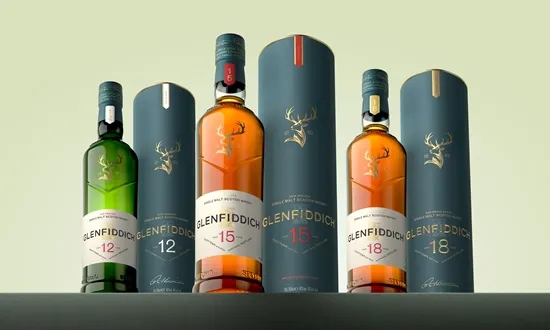
The cornerstone of this revitalized packaging is, without question, the enduring symbol of the brand: the majestic stag. This emblem has graced Glenfiddich bottles since the 1960s, serving as a visual anchor to its Speyside origins. Its initial inspiration is traced back to the renowned 19th-century masterpiece, Sir Edwin Landseer’s 1851 painting, The Monarch of the Glen. However, in this contemporary iteration, the stag has undergone meticulous refinement. The artistic team focused on imbuing the depiction with enhanced texture and organic fluidity, aiming to better capture the rugged, untamed beauty of the Glenfiddich distillery’s home territory in Speyside, Scotland. The reworked stag is not merely a static image; it is crafted to evoke the very character and complexity inherent in the whisky it contains—a spirit matured amidst the landscape it visually represents. Furthermore, to anchor this modern interpretation firmly in the brand’s lineage, the refined stag is now elegantly framed by the founding year of the distillery: 1887, a silent testament to nearly a century and a half of distillation expertise.
Will Peacock, the Global Brand Managing Director for William Grant & Sons, the parent company, articulated the strategic intent behind this transformation. Peacock emphasized that the design evolution is a deliberate act of balancing reverence for history with the demands of modern luxury aesthetics. "With Glenfiddich’s design evolution, we are pleased to reveal a refreshed look that honours the past of this 139-year-old whisky while celebrating a timeless modernity," Peacock stated. He further elaborated on the significance of the redesign, positioning it as a clear signal of the brand’s ongoing relevance: "This latest transformation reflects Glenfiddich’s living legacy as a British luxury icon while setting the scene for its next chapter." This dual focus—honoring the 139-year history while actively projecting a modern image—is crucial in retaining the loyalty of established connoisseurs while simultaneously attracting a new generation of discerning drinkers.
The 1960s connection is particularly resonant. It was during this period that William Grant & Sons took the unprecedented step of bottling and marketing their malt as a single malt, rather than solely using it for blending. This act of defiance against established industry norms—where single malts were typically an unheralded component of blended whiskies—was revolutionary. Glenfiddich essentially carved out the premium Single Malt category from the ground up. The new packaging subtly nods to the bold, often colorful, and pioneering aesthetics of that era’s product launches, signaling a return to that trailblazing mindset.
Examining the physical changes, while the specific details of the entire range refresh are extensive, the primary focus remains on enhancing the tactile and visual premiumness of the bottle itself. Changes often include subtle refinements to the glass structure, improved balance in the label placement, and elevated finishing techniques—such as debossing, specialized varnishes, or metallic accents—that speak directly to the high-end segment of the luxury spirits market. These material improvements are designed to communicate quality even before the consumer engages with the liquid inside.
The integration of the founding year, 1887, serves a specific marketing purpose. In an industry saturated with heritage claims, grounding the visual identity with an immutable date provides an authentic benchmark of longevity. It subtly counters the rapid growth of newer distilleries by asserting deep, unwavering roots in the Speyside region, linking every bottle back to the original vision established by William Grant himself.
Furthermore, the narrative surrounding the packaging often extends beyond the bottle and into the secondary packaging—the gift boxes or outer cartons. In recent luxury packaging trends, these secondary elements have become crucial touchpoints for storytelling. It is highly probable that the new external presentation features richer textures, maps detailing the distillery’s location, or subtle graphical elements that reference the Speyside geography and the Dufftown region where the distillery is situated. These additions enrich the ‘unboxing’ experience, transforming the purchase into an immersive introduction to the Glenfiddich world.
This strategic refresh also aligns with broader market trends emphasizing provenance and authenticity. Modern consumers, particularly in the premium spirits sector, demand transparency and a clear understanding of where their product originates and the values it represents. By emphasizing the stag, the landscape, and the founding date, Glenfiddich is effectively packaging its origin story into a highly recognizable and desirable format. The ‘living legacy’ Peacock mentions is not just about tradition; it’s about actively cultivating a brand narrative that remains vital and relevant in a rapidly evolving global marketplace where Scotch whisky faces intense competition from other premium spirits categories.
The decision to focus on the 1960s inspiration is particularly shrewd. It allows the brand to celebrate a history of successful disruption. In the 1960s, they were breaking the mold; today, by referencing that era, they signal their intent to continue innovating within the premium space—perhaps hinting at future product innovations or new market penetrations that require the same pioneering spirit.
In conclusion, Glenfiddich’s packaging unveiling is a masterclass in heritage branding leveraged for future growth. By meticulously refining its most recognizable symbol, the stag, and embedding clear markers of its history (1887) within a contemporary, premium framework inspired by its revolutionary 1960s launches, the distillery is ensuring its visual identity remains as compelling and world-class as the whisky it contains. This is not merely new wrapping paper; it is the strategic recalibration of a global icon, designed to capture the attention of both long-time devotees and the next generation of malt enthusiasts.


