
In the sophisticated world of global publishing, where the written word is both an art form and a highly competitive commodity, brand visibility often depends on more than just a compelling dust jacket. For Bloomsbury Publishing, a house synonymous with literary excellence and a portfolio that spans from the magical realms of Harry Potter to the rigorous halls of academic research, the challenge of maintaining a contemporary edge while honoring a storied heritage is a constant creative endeavor. Recently, this challenge manifested in the search for a promotional vehicle that could transcend the utility of a standard "book bag" and become a coveted fashion accessory in its own right. The result was a masterclass in minimalist design and high-impact accents: a custom-engineered tote bag that utilized neon handle technology to disrupt the visual monotony of traditional literary marketing.
The publishing industry has long relied on the cotton tote bag as its primary promotional workhorse. From the London Book Fair to the various "Freshers’ Fairs" held at universities across the globe, these bags are ubiquitous. However, this very ubiquity creates a problem of "brand camouflage." When every publisher is handing out a beige or black canvas bag, the individual brand identity of a house like Bloomsbury can easily become submerged in a sea of generic merchandise. To combat this, Bloomsbury sought a partnership with The Bag Workshop to develop an item that functioned as a "walking billboard," ensuring that their brand remained front-and-center in the minds of readers, students, and industry professionals.
The design philosophy for this project was rooted in the concept of "classic with a twist." Bloomsbury did not want to abandon the elegance that defines their corporate identity, but they recognized the need for a modern "pop" to capture the attention of a younger, trend-conscious demographic. The foundation of the bag was built on high-quality, heavy-duty cotton canvas. Unlike the flimsy, low-grammage alternatives often found at trade shows, this material was selected for its tactile premium feel and its structural integrity. A book bag, after all, must be able to support the weight of several hardback volumes without losing its shape or straining the seams.
The first major hurdle in the production process was the requirement for exact brand alignment. For a global entity like Bloomsbury, "close enough" is never sufficient when it comes to color. The Bag Workshop utilized a meticulous Pantone-matching process to ensure the fabric panels of the bag perfectly mirrored Bloomsbury’s official brand palette. This level of precision is what separates bespoke manufacturing from mass-market sourcing. By dyeing the fabric to specific coordinates, the team guaranteed that the bags would serve as a seamless extension of the publisher’s existing marketing collateral.
To ensure the logo was as crisp as the prose Bloomsbury publishes, the decision was made to print the iconic white logo onto the panels before the bags were actually sewn together. This is a critical technical distinction in the world of custom bag manufacturing. Most promotional bags are printed "off the shelf," meaning a pre-made bag is placed under a screen. This often leads to "dead zones" near the seams or handles where the ink cannot reach, and it limits the print area. By printing on flat panels first, the team achieved a flawless, edge-to-edge finish that exudes a sense of professional craftsmanship. The stark white of the logo provided a high-contrast focal point against the deep, Pantone-matched background, ensuring legibility even from a distance.
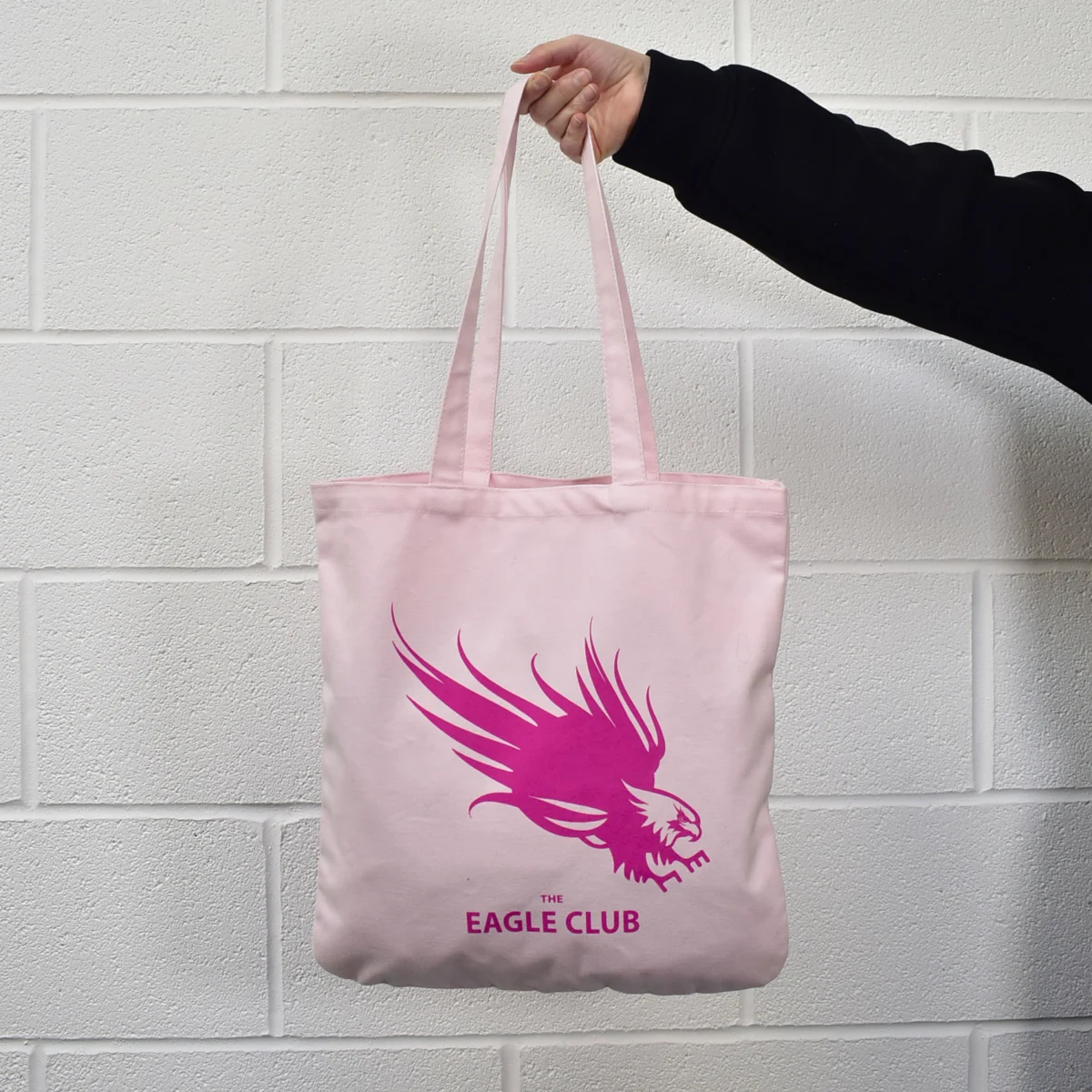
However, the true stroke of genius—the "bold twist" mentioned in the project’s inception—was the introduction of the neon handles. Moving away from the traditional self-fabric handles (where the handles are the same color as the bag), the design team introduced two vibrant options: a high-visibility neon green and an energetic neon pink. These handles were crafted from robust cotton webbing, providing a textural contrast to the canvas body and offering superior comfort for over-the-shoulder carry.
The choice of neon was a strategic move in color psychology. Neon shades are "attention-interrupters"; they vibrate against more traditional colors, drawing the human eye naturally toward the source of the light. By pairing these electric hues with the sophisticated, dark-toned body of the bag, Bloomsbury created a product that felt both grounded and rebellious. It was a visual metaphor for the publishing house itself: a stable, respected institution that is nonetheless unafraid to champion vibrant, new, and cutting-edge voices.
The dual-color strategy also served a functional marketing purpose. By offering two different handle colors, Bloomsbury introduced an element of choice and "collectibility" for the recipients. At literary festivals and author events, this sparked immediate engagement. Attendees were seen comparing their bags, and the vibrant colors acted as a beacon, prompting others to ask where they could acquire one. This organic "buzz" is the holy grail of promotional marketing. The bag ceased to be a mere container for books and became a status symbol of the literary community.
Beyond the aesthetics, the success of the Bloomsbury tote was bolstered by the logistical and collaborative excellence of the production team. Internal testimonials from the project highlight the roles of key individuals, such as Bella, who oversaw the meticulous design phase, and Greg, who managed the complexities of production and delivery. In the world of bespoke manufacturing, the transition from a digital mock-up to a physical product is fraught with potential pitfalls—from ink bleed to seam misalignment. The Bag Workshop’s commitment to "care and attention" ensured that the final delivery met the high standards of a client accustomed to excellence.
The impact of the bags was immediately measurable. Deployed at high-traffic events like university freshers’ weeks, the bags provided Bloomsbury with a dominant visual presence. In a setting where students are bombarded with freebies, the neon-handled totes were the items that students kept, reused, and carried across campus for months afterward. This longevity is where the true value of high-quality branded merchandise lies. Every time a student carries that bag to the library or a reader takes it to a local bookstore, Bloomsbury receives a "brand impression" that is far more authentic and lasting than a digital banner ad.
In retrospect, the Bloomsbury neon-handled tote bag project serves as a definitive case study in the power of the "simple but effective" design mantra. It proves that you do not need to over-complicate a product with unnecessary pockets, zippers, or internal prints to make it stand out. By focusing on three core pillars—material quality, precise color matching, and a singular, daring design choice—Bloomsbury and The Bag Workshop created a promotional tool that redefined the standard for the industry.
As the publishing world continues to evolve in an increasingly digital age, the value of a tangible, beautiful, and functional object cannot be overstated. The Bloomsbury tote is more than just a bag; it is a piece of brand storytelling. It tells the story of a publisher that values quality, understands its audience, and isn’t afraid to add a little neon brilliance to the world of black and white text. For other brands looking to make a similar impact, the lesson is clear: identify the "standard" in your industry, and then find your own version of the neon handle to ensure you are never lost in the crowd.

