
The Enigmatic Allure of Bruichladdich’s Black Art: A Masterclass in Sensory Branding and Global Travel Retail. In the world of premium spirits, transparency is often touted as the ultimate currency; distilleries obsess over grain provenance, cask finishes, and precise maturation timelines. Yet, Bruichladdich has carved a defiant path in the opposite direction with its storied Black Art series. By stripping away the technical specifications and inviting the consumer to engage purely with the liquid, the Islay-based distillery has turned mystery into its most potent marketing asset. This philosophy has reached a new zenith with the latest release, "Black Art Sapero," a project brought to life through a sophisticated strategic partnership with the branding and design agency Thirst.
The launch, which debuted at the high-traffic luxury retail environment of Singapore Changi Airport before expanding into global travel retail channels, represents more than just a new product—it is a study in how to maintain an aura of exclusivity in an age of over-information. The core tenet of the Black Art range remains steadfast: the recipe is known exclusively to the head distiller. There are no age statements to scrutinize, no cask breakdown charts to analyze, and no tasting notes to bias the palate. It is an exercise in radical trust, challenging the drinker to shed their preconceptions and surrender to the raw, unfiltered experience of the whisky itself.
To translate this abstract concept into a physical retail presence, Bruichladdich tapped the creative expertise of Thirst. The agency was tasked with developing the brand guidelines, content production, and in-store activation strategies that would introduce Black Art Sapero to the international traveler. The result is a design language that feels less like a product label and more like a relic from an esoteric ritual.
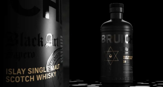
The visual identity of the packaging is steeped in atmospheric storytelling. At the heart of the design, a pair of hands rises in a gesture of reverence, cradling a single, suspended droplet of whisky. This imagery serves as a powerful metaphor for the precious nature of the liquid and the almost religious devotion required to create it. The color palette is intentionally somber and luxurious, dominated by deep, tactile black textures that absorb light rather than reflecting it. These dark, matte finishes are punctuated by intricate, gothic-inspired typography and sharp, strategic flashes of gold. The contrast is deliberate, suggesting that within the darkness of the unknown lies something of immense, shimmering value.
Gareth Brown, the Global Marketing Director at Bruichladdich, emphasizes that the brand’s commitment to mystery is not a gimmick, but a fundamental pillar of its identity. "Black Art has always been about embracing what we don’t fully understand," Brown explains. "It invites drinkers to trust their senses and experience whisky in a different way, without the crutch of explanation or the burden of expectation. With this latest release, we wanted to build on the legacy of the Black Art range while amplifying that sense of intrigue for travelers who are looking for something that transcends the standard retail experience."
For the design team at Thirst, the challenge was to create a brand world that felt sophisticated without being pretentious, and secretive without being exclusionary. Matt Burns, the Executive Creative Director and founder of Thirst, notes that the design process was one of subtraction rather than addition. "With Black Art Sapero, our focus was on refining and expressing what already makes the Black Art series so distinctive," Burns says. "In a market saturated with data-heavy packaging, we wanted to go in the opposite direction. Rather than over-explaining the whisky through technical jargon, the design invites people to lean in, trust their senses, and feel the mystery for themselves. It’s about creating a world around the whisky that feels confident, considered, and quietly seductive."
The success of this launch in the global travel retail sector is particularly significant. Airports are notoriously crowded marketplaces where brands often fight for attention through loud, aggressive visuals. By choosing a path of "quiet seduction," Bruichladdich and Thirst have managed to cut through the noise by offering a moment of stillness and curiosity. The in-store expression of the campaign—from the digital content displayed on airport screens to the tactile nature of the product displays—encourages travelers to pause. It creates a psychological "stop-gap" in the frantic pace of international travel, compelling the consumer to engage with a product that asks them to let go of their analytical minds.
This strategy speaks to a broader shift in luxury consumer behavior. As high-net-worth individuals and enthusiasts become more fatigued by the "gamification" of whisky—where collectors hunt for rare age statements or specific batch numbers—there is a growing hunger for emotional and sensory resonance. Bruichladdich is betting that the story of the "unknown" is more compelling than the story of the "measured." By keeping the recipe hidden, the distillery ensures that every bottle of Black Art Sapero remains a conversation starter. It forces the consumer to discuss the flavor profile, the texture, and the finish, rather than debating whether a 25-year-old expression is mathematically superior to a 20-year-old one.
Furthermore, the collaboration highlights the importance of deep, symbiotic relationships between brands and their creative partners. Thirst did not simply design a box; they helped curate an entire brand architecture that justifies the premium price point of the product. The consistency between the digital content, the physical packaging, and the in-store environment ensures that the "Black Art" identity remains coherent across every touchpoint. Whether a customer is encountering the brand for the first time in Singapore or picking up a bottle in a boutique in London, the message is uniform: you are entering a space where the liquid is the ultimate authority.
As the whisky industry continues to evolve, the Black Art series stands as a testament to the power of artistic intent. It serves as a reminder that whisky is, at its core, a sensory art form. By removing the technical barriers that often distance the consumer from the liquid, Bruichladdich and Thirst have succeeded in creating a product that feels both ancient and modern. It is a bold, uncompromising approach that treats the drinker as an equal—someone capable of discovering their own truth within the glass, without the need for a guidebook.
Ultimately, the Black Art Sapero release is a masterclass in modern luxury branding. It proves that mystery, when executed with high design and intentionality, is a commodity that is far more valuable than a list of ingredients or a breakdown of cask types. It invites us to stop calculating and start tasting, to stop looking for answers and start enjoying the questions. In a world that demands we define, measure, and categorize everything we consume, Bruichladdich offers a rare, seductive alternative: the freedom to simply experience the mystery. Through the evocative design by Thirst, the brand has solidified its position not just as a producer of fine spirits, but as an architect of experiences—one black, gold-flecked bottle at a time.


